Beyond Braille: What Goes Into High-Quality Interior ADA Signage?
Others accessible signage,ADA Compliance,ADA Signage,Braille signs,branded ADA signs,high-quality signage,inclusive design,Interior signage design,Wayfinding signageBy now, you’ve probably heard about the importance of interior signage ADA accessibility. But did you know that, according to Be My Eyes, businesses that prioritize accessibility have 28% higher annual revenue, double the net income, and 30% higher profit margins?
Accessibility pays, yes, but there’s a trap. Too many businesses think ADA compliance starts and ends with Braille dots. Stop there, and you risk customers not coming back, negative reviews stacking up on Google, and leaving that potential higher profit on the table.
That’s why interior signs must combine ADA compliance and high-quality materials and design
But what does high-quality interior ADA signage mean?
High-quality ADA signage goes further. It guides, reassures, and reflects your brand while making every visitor feel included. But miss this, and your “ADA signs” won’t be doing their job at all.
In this blog, we’ll break down what truly makes ADA signage high-quality and why it matters for your business.

ADA Compliance 101: More Than Meets the Eye
The Americans with Disabilities Act (ADA) helps individuals with diverse needs navigate a space by creating legislation for accessible signs. These designs are meant to promote dignity, inclusion and create a space that works for everyone who walks through the door.
ADA Braille Signage Requirements
Only specific types of signage require tactile and Braille elements, but not all signs fall under ADA signage requirements. So how do you tell the difference?
Here are signs exempt from ADA Braille requirements:
- Temporary signs (posted for 7 days or less)
- Building addresses or directories
- Occupant names, company names, and logos
- Menu boards
- Seat or row designations in theaters or stadiums
- Signs in non-public areas of detention/correctional facilities.

These types of signs can still be branded and functional, but they don’t require tactile lettering or Braille to be legal.
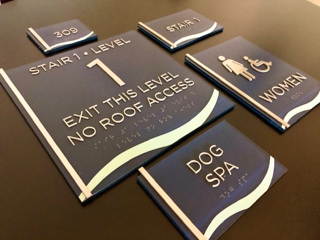
If your signage identifies a permanent room, space, or function—like restrooms, meeting rooms, storage areas, stairwells, or exits—it must include tactile lettering and Braille. And not just any Braille: the ADA requires specific formatting for clarity and consistency.
What that means in practice:
- Font size and style: Characters must be between 5/8 inch and 2 inches tall, in a simple sans serif typeface. No italics, no scripts, no decorative fonts.
- Contrast: Text and background must clearly contrast—light on dark, or dark on light—for easy visibility.
- Braille placement: Grade 2 Braille must be placed directly below the corresponding text, not off to the side or at a separate location.
- Mounting height: Signs must be installed so the tactile characters are located between 48 and 60 inches from the floor, within easy reach.
- Finish: The surface should have a non-glare, matte finish to ensure readability under different lighting conditions.
With nearly 44 million adults in the U.S.—that’s 13.6% of the population—living with a disability, accessible signage helps you serve a broader and diverse audience. In turn, it eliminates confusion and makes navigation easier for your customers.
Think of your sign as an extra employee, one that delivers the perfect first impression for your business without saying a word. Now your clients know where to go, what to do, and who to talk to in case of an emergency.
How to Combine Functionality and Branding
For many businesses, it’s tempting to think ADA signage can be done by printing something cheap, sticking it on a wall, and calling it a day.
But while low-quality signs may technically meet ADA guidelines, they don’t support your business image or your brand. They are absolutely prone to crack, fade, and even look out of place, making people question “Who put that there?” instead of making an impression or orienting an action.
And believe us, that impression sticks in your customer’s mind every time they come to visit your business.
That’s why the use of high-quality ADA signage can blend into your environment like a tailored suit, but also reinforce your identity from visit number one to visit number 100.
Think of the Southwest Middle School, for example, where we created inclusive signs that clearly identified classrooms, like the auditorium, while also incorporating hearing-aid symbols and Braille. Every detail respected the school’s culture and commitment to accessibility..
Or take the Riverwalk Lofts, where signage not only marked suites but also guided visitors and residents with universally recognized icons—male, female, and accessible symbols—that blended into the hotel’s style..
And in theatres, where design often takes center stage, our signage complemented branded interiors instead of clashing with them, making navigation feel instinctive.
When function meets branding, you get the best of both worlds: compliance that protects your business and a cohesive experience that elevates it.

Why Professional Expertise Matters
One of the biggest misconceptions businesses have is thinking ADA codes are static, but nothing could be further from the truth. They’re precise, detailed, and constantly updated. A single wrong font size, a misplaced Braille label, or poor color contrast can put you out of compliance, leaving your business open to fines—or worse, excluding the very people your signs are meant to guide.
That’s where professional expertise makes the difference. At Metro Sign & Awning, we go beyond simply “meeting code.” We translate technical requirements into signage that’s compliant, durable, and unmistakably on brand.
Here’s what sets us apart:
- Efficient installation: Whether it’s a single lobby sign or a full-campus system, we deliver on schedule with minimal disruption.
- High-quality materials: Our signs are built to last, resisting wear, fading, and damage, even in high-traffic environments.
- Cohesive branding: From color to finish, every detail reinforces your identity while keeping accessibility front and center.
The result? Signs that are impossible to miss, not because they’re loud or out of place, but because they work exactly as they should: guiding, welcoming, and representing your brand with integrity.
Ready to upgrade your ADA signage? Request a free consultation and site audit with Metro Sign & Awning.