The Art of Sign Design: How to Create an Effective Sign
Exterior Signage, Signage TipsThe truth is that a sign is a significant piece of graphic communications that – done properly, cleverly, creatively, and intelligently – can generate, attract, and direct public attention almost wherever you want it. But done poorly, you might as well throw a tarpaulin over your sign and haul it off to the dump.
Here at Metro Sign and Awning, we pride ourselves on the intelligent and cost-effective use of every single “trick of the trade” to make your sign do the best possible job for you. For example, we:
Clarify the Purpose of the Sign
As Yogi Berra famously said, “If you don’t know where you’re going, you’ll wind up someplace else.” We find that when we work closely with clients to help them zero in on what they want their sign to accomplish, all the rest of the sign design and fabrication process falls into place much more easily and effectively.
Identify the Target Audience
Same as above. It’s easier to attract people’s attention when you know what most readily catches their eye, heart, and mind.
Accelerate Message Delivery
People read and absorb the messages of a sign at different rates of speed. But we know the tricks to drive those messages home at the fastest rate each viewer of your sign can handle.
Burnish the Graphics
What’s true for text is even truer for the visual elements of your signage. Our designers are fluent in “signage graphics” and can translate the various messages you’re trying to convey into just the right visuals.
Choose the Best Overall Shape
Signs can be rectangular, square, oval, circular, complex, or the shape of any familiar object. Making this choice correctly adds considerably to the overall impact of the sign. Getting it wrong can … well, there’s just no excuse for getting it wrong.
Dial in the Color Psychology
Shapes of letters and images on a sign can be more or less important, depending on the colors in which those shapes are executed. We take the time to get the colors precisely dialed in to deliver the maximum emotional and physical impact on those viewing your sign.
Fine Tune the Contrast Between Elements
Mastery of the language of visual communications entails making all the elements work together as a unit. Watch how we take what seems an ordinary sign and make all its messages “pop” with vibrancy.
Hone the Text
The word messages on your sign are central to its effectiveness, because attracting all the attention in the world won’t help your business if you deliver an inferior message.
Tweak the Kerning
Without going too deeply into the psychology of message conveyance, the relationship between the letters on your sign, and the graphics, too, can produce the same improvement in your next sign as the difference between lighting and a lightning bug. We work very hard to get these details right for you.
Consider the Context
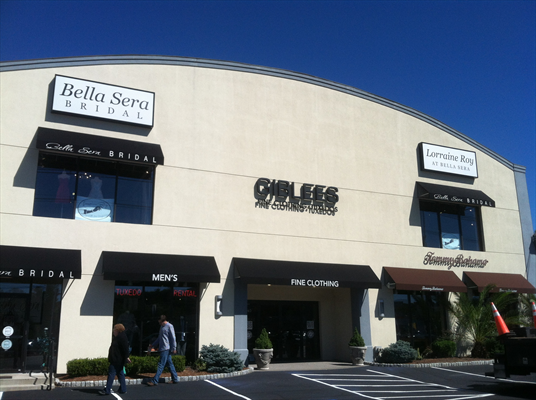
If your sign were hanging alone in the woods, it would readily stand out. Against a backdrop of many other signs, shapes, colors, and human constructs, it takes experience and a wide range of sign-making expertise to make sure your sign rises above the visual noise.
Surprised at all the details and nuances that go into making a great sign? Don’t be. You haven’t even heard them all, yet.
This list reflects only a small portion of the factors we consider, balance, and optimize as we work to help your sign produce the best possible return on your investment.

