The Importance of Signage in Branding Multi-Family Buildings
Architectural Signage, Branding, Community, Customer Spotlight, Design/Build, Partners-Developers-Contractors, Residential SignageBelieve it or not, when it comes to choosing where to live, attractive branding can make the difference between signing a tenant and having vacancies. Think about other brands with logos that trigger instant recognition: Coca~Cola’s white lettering on a red can; the Nike swoosh; Adidas’ black and white trefoil.
Looking to fill a brand new apartment building? Start by establishing brand recognition within the community. Want to keep residents from leaving? Associate that brand with trust, reliability, and value.
Still not sure if an apartment community really needs its own brand identity? Check out these statistics:
- 66% of consumers indicate that shared values influence the brands they choose
- 75+% of consumers make purchases based on brand/company name
- 90% of consumers expect to see brand consistency across physical locations and social/news media platforms
- 75% of marketing leaders rate branding critical for company growth
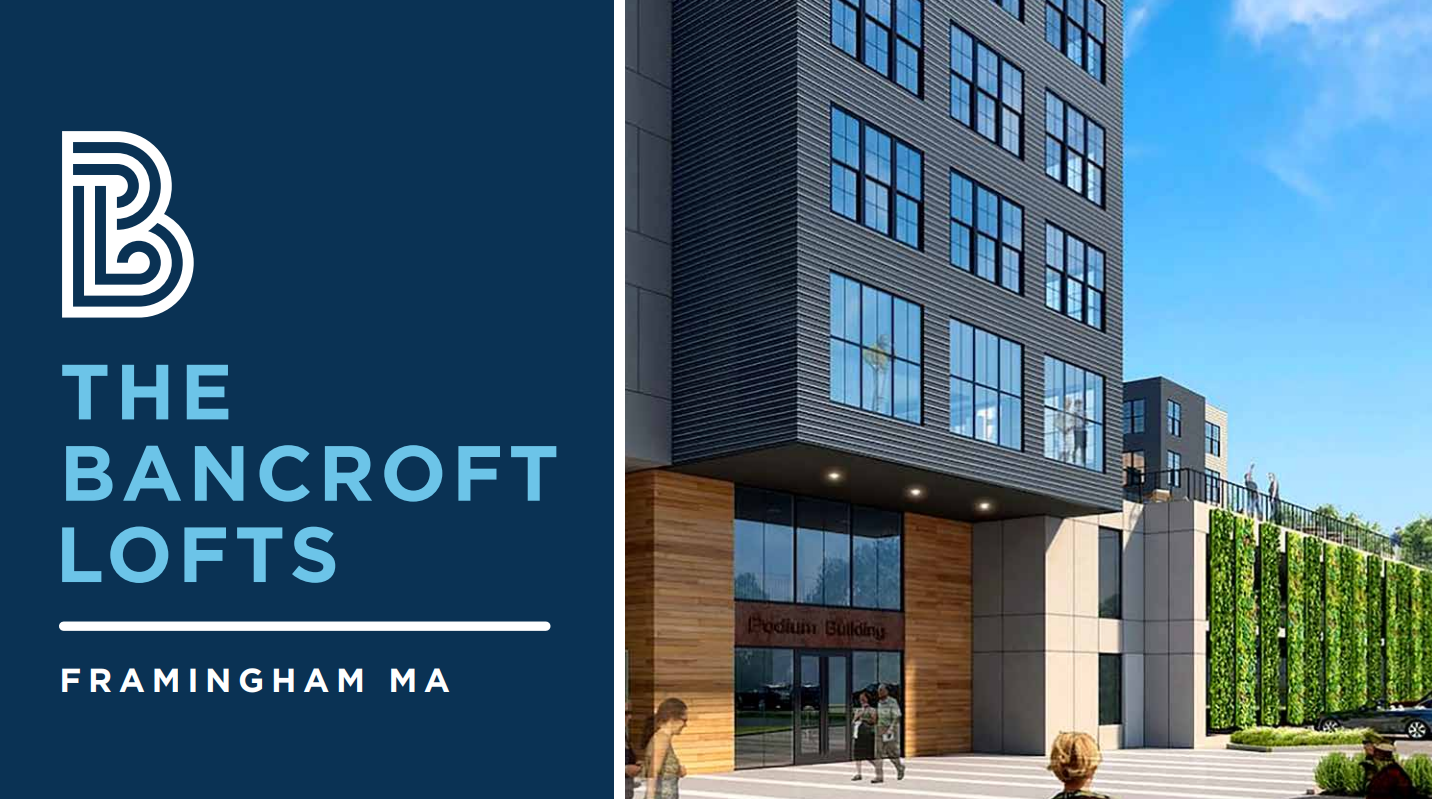
But what does apartment branding look like in real life? We invite you to explore Bancroft Lofts—a three-building complex comprising The Powerhouse, The Vista, and The Bancroft. Metro partnered with design partner Proverb Agency and Jaime Sullivan from the Fox Shop to create the signage for the three renovated/new buildings.
A New Chapter for Bancroft Lofts
The Bancroft Lofts building—built in 1906 by the R.H. Long Shoe Company—has led a long, interesting life. While it originally housed a factory that made shoes, that factory pivoted to make automobile bodies in the early 1920s. Later, this historic building housed local artists, craftsmen, and creators.
What sets this former New England Mill apart from other mills converted into apartments—and what provided the inspiration for Bancroft Lofts’ branding and signage—is its unique construction.
Concrete, rather than bricks, comprise its shell. The use of heavy concrete evokes the Brutalism architectural style. While at first, it appears heavy and immovable, its composition plays with light and shadows and creates patterns upon patterns.
Brutalism has a close relationship with the Bauhaus movement and it’s that movement—which focuses on simple, rational and functional design and simple geometric forms—that inspired the brand positioning of the Bancroft Lofts.
Bancroft Lofts will soon open in a new role as luxury apartments. The renovated factory space will house high-ceiling lofts; the newly-built Vista building will include contemporary apartments. The renovated and repurposed the “Powerhouse,” offers a centrally-located amenity space.
Components to Bancroft Lofts’ Branding
Proverb developed the brand’s identity and voice, chose the colors, and recommended the typography. Our design team’s input helped to ensure the new branding followed best signage practices. The client wanted a uniform signage package that worked symbiotically with existing interior brand elements.
Metro took the branding package, which included a monogram—developed by Proverb—and worked to create a balance that highlighted each element without drawing attention away from them. We also saw an opportunity to work with Fox Shop again, bringing in Jaime to apply her talents for creating concepts that transfer well to the build environment. Proverb created the style guide and Jaime developed the logo into three different concepts from which the owners choose the “winner” which we also applied to the brand typography, and colors used throughout the entire marketing campaign.
Here are some of the specific sign elements on which we worked.
 No bland bathroom signs here
Our brand strategist, Colin Middleton, collaborated with our design partner, Proverb Agency, to develop many unique designs. The monogram “BL” features nice line quality, mixing hard angles and soft curves with a bold, impactful line thickness, very evocative of the Bauhaus motifs.
Sustainability for the win
The client thought salvaging and incorporating the doors into the new buildings would be in keeping with the history and feel of the concept—a “useful art” approach. So we repurposed reclaimed doors from the original factory into our signage designs, and when completed, they’ll provide wayfinding directions in the elevator lobbies.
The doors did provide a bit of a design challenge which involved finding the right treatment, because their surface lacks uniformity. Creating files that could print on various materials and still represent the blackened steel look that was a key part of the branding proved especially tricky. We tried vinyl but scrapped the idea quickly because it didn’t work well on the doors’ uneven surfaces. Ultimately, we chose to bring in a painter to stencil the designs directly on the doors and achieve the look our client wanted.
Exterior signs that enhance, invite, and guide
We took Proverb’s branding concept to develop the signs we built and installed on Fountain Street and in the triangle formed by The Powerhouse, The Vista, and The Bancroft. This signage had to complement Bancroft’s branding and meet city requirements. As the first wayfinding sign visitors and residents would encounter, it had to be clean and easy to read.
Unique Branding for a Unique Building
 We thoroughly enjoyed our contribution to bringing new life and purpose to a historic building. Partner collaboration and innovative problem-solving helped ensure that the signage throughout the project aligned with the branding. The story of life at Bancroft Lofts is just beginning—and now this multi-family complex includes fresh, new branding to help share its story with the community.