Re-Branding An International Chain: Lake Region Medical
Architectural Signage, Design/Build, Others, Partners-Developers-Contractors, Sign DesignOne of our most demanding projects in recent memory has been taking part in the rebranding of a chain of medical centers that crossed not only state but national borders!
It began in March of 2014 when one of our long-time customers, Winbrook Associates, asked us for help. Their customer, Lake Region Medical, had purchased all 18 locations of a company called Accellent, and now the facilities had to be re-branded.
We began with a design review and offered some initial signage concepts. But to support the rebranding while the design and build process took place, we installed temporary banners at every location: Just the name “Lake Region Medical” in black text on white material.
Our crews surveyed the local sites, which included Brimfield, Fiskdale, and Wilmington, MA, plus Laconia, NH, and and we partnered with trusted subcontractors to do the same at other locations, which included Upland, CA, Orchard Park, NY, Brooklyn Park and Chaska, MN, Collegeville, PA, Salem, VA, Trenton, GA, Wheeling, IL, and El Paso, TX.
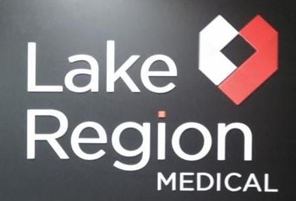
By the fall of 2014, we had finalized a new Lake Region Medical logo and created concepts for each of the new locations.
Upon receipt of the site specific survey / field information, we developed a plan to meet the needs of each site using the new logo/brand. It all went smoothly, even though the Wheeling, IL site, in particular, took a long time to finalize because of some highly specific rules in place there.
Our goal was to maintain as much uniformity and replicate as many elements as possible across all sites, essentially providing brand consistency despite the differing size requirements of the various sites, and the individual needs and preferences of the landlords and facility managers at each site.
Naturally, there were challenges. For example, our plan for a 48 inch logo turned out to be too large for some of the facilities’ facades. This forced us to fabricate “heart” icons in custom sizes for most of the different locations.
Ultimately, we managed the project as turn-key, did the fabrication in our Boston shop, then packaged or crated and shipped out the items for installation.
The project was broken out into phases: Phase 1 included most of the signage. Phase 2 included the customized “heart icons,” which benefited greatly from the help we got from Winbrook.
We’re happy to report that our team completed the project on time and under budget, wrapping it all up this month – March, 2015. You can see the results in our Portfolio.
Managing work in other countries, as well as other states, from our Boston office, was a rewarding experience. What’s next? The Metro team is ready to work on your next challenging signage project. Give us a call at 978-401-4648 or contact us today.