Complying with the Americans with Disabilities Act
ADA, Architectural Signage, Design/Build, Others, Partners-Developers-Contractors, Signage Regulations, Signage TipsThe Americans with Disabilities Act (ADA), which first became the law of the land in 1991, has made incalculable improvements in the lives of countless people. More recently revised in 2010 and made mandatory as of March 15, 2012 for virtually all new construction and renovations, the ADA has resulted in a system of “best practices” that make it possible for disabled persons to access and enjoy an extremely wide range of public and private built environments.
Many people think the ADA just requires Braille on certain signs, but it’s considerably more comprehensive than that. Compliance can impact a great many of your project’s signage (and design/construction) specifications. Unfortunately, the ADA’s requirements are sometimes ambiguous.
That’s one reason Metro Sign and Awning has become expert in applying the ADA standards to clients’ projects. We strive to minimize the cost and confusion of ADA compliance without sacrificing a project’s original architectural and design intent. Our goal is to help ensure your project looks and works great, and that ADA enforcement actions are an extremely unlikely part of your future.
Here’s a brief rundown of some of what it means for your next project’s signage to live up to the ADA standards:
A wide variety of public signage – including signs identifying rooms, exits, or accessible features of the building or project, as well as signs providing directions or information about functional spaces – must contain braille or other raised characters, and such signs must be established with clear floor spaces that are beyond the arc of any door swing. (Advertising and marketing signage, as well as temporary signs and company identifiers need not comply with the ADA.)
Regulated signs must have backgrounds or characters that do not provide glare (except for intentionally reflective signs in parking and vehicular traffic areas). They must also be made with high contrast ratios between the sign’s background and the sign’s informative characters and symbols.
Typefaces must be easy to read. Directional and informational signs can use capital and lower case letters and more modern typefaces (such as “Helvetica,” “Futura,” “Avant Garde,” or “Verdana”) without embellishments. So-called “condensed” or “extended” typefaces are never allowed, nor can the characters be formed from lines that are too thick or too thin, compared to the size of the letters themselves. The required size of the letters on a given sign is dependent on the sign’s height from the floor and its distance from where a visitor is like to be positioned when viewing the sign.
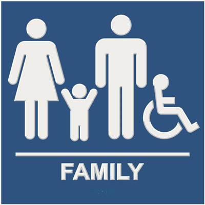
Specific rules govern signs used to identify rooms, such as restrooms and meeting rooms. For example, the information must be presented both in characters and in Braille between 5/8″ and 2″ tall, and must be positioned so the lowest characters are between four and five feet off the floor. Any pictograms, like silhouettes of males and females to indicate gender-specific restrooms, must be at least 6″ tall, and using them does not replace the requirement for text and Braille.
There is more, of course.
Metro Sign and Awning will be happy to help determine which signs in your project must comply with the ADA regulations, and which need not. We will also work with your architect and/or design team to make sure that, despite the complex requirements of ADA, your signage never loses its connection to either your branding or your intent.
If you’d like to know more this complex but important subject, please give us a call at 978-401-4648.

