Much-Needed Signage Facelift For Daikayama Restaurant
Customer Spotlight, Exterior Signage, Others, Partners-Developers-Contractors, Signage Regulations, Signage TipsAs Shakespeare wrote (Act II, Scene 2, “Romeo and Juliet”): “What’s in a name? That which we call a rose by any other name would smell as sweet.”
But Shakespeare never met a modern consumer, beset on all sides by a wide variety of choices and aggressively courted by all manner of tempting offers. In today’s economy, the right name can make all the difference between one type of flower that sits unappreciated on a shelf somewhere and another, very similar, type of flower that shows up in every suitor’s hand as he nervously rings the doorbell of his beloved.
While Shakespeare had some reason to believe in those simpler times that names didn’t really matter much, the Bard of Avon would certainly acknowledge that today business signs carrying those names can lead to major differences in how a business is perceived, how often and how favorably it is noticed, and how well it performs in the marketplace.
This seems at first to be an abstract concept, but it boils down to a very practical aspect of achieving and maintaining business success in today’s economy.
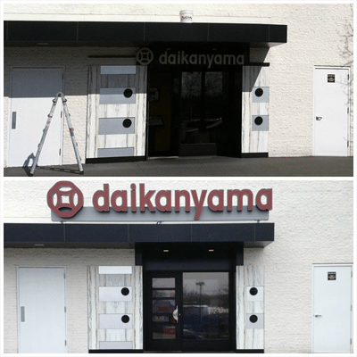
The Daikayama Transformation
Take the case of Daikayama Restaurant, the premiere Japanese cuisine restaurant that’s located in the Chestnut Hill Mall in Newton, MA. As you can see from the “before” and “after” photos, initially the restaurant was practically invisible to most passers-by. And let’s face it: no matter how great a restaurant’s food, its appearance, fragrance, and taste are not going to penetrate the walls and attract the attention of shoppers who happen to drive by.
To do that requires an eye-catching sign that’s both memorable and evocative of the image (and yes, the “brand”) that the restaurant is trying to convey.
As the project unfolded, Metro Sign was called upon to help Daikayama increase its business and better establish its brand in a crowded market.
From Invisible to Eye-Popping
When we first visited the location, we saw immediately that the existing signage was tucked underneath an overhang and was also forced to compete with the extremely large size of Bloomingdale’s sign located higher up on the same facade. Given the size and location of its inadequate signage, Daikayama’s name simply wasn’t visible enough to the mall traffic, particularly to motorists and pedestrians across the mall’s expansive parking lot.
To draw more consumer attention and better present Daikayama’s brand, Metro Sign designers worked with the client’s architect, Darlow & Christ, to gain Planning Board Approval and a Variance that would allow the restaurant’s new sign to be mounted on the roof of the overhang for improved visibility.
The brown/red color of the sign accurately represents the image of the restaurant and its brand, but from a technical perspective was more difficult to illuminate than conventional white “channel” lettering. We met with the architect and tested a variety of translucent vinyl colors, experimenting with them on an LED illuminated light box to provide full observation of their appearance, both night and day.
As the signage design came together, we found that painting the raceway to match the background would help it fade into the structure and allow the restaurant name to visually “pop” and attract maximum attention.
The net result is a vastly more visible appearance for Daikayama restaurant and a very pleased restaurant owner.
Looking at the Daikayama photos, wouldn’t you agree? Whether you do or you don’t, we’d like to hear from you.